Legal agreements help you maintain control over your business, protect your intellectual property, and manage the expectations of your users.
Common legal agreements that can be found on most websites and mobile app include Terms & Conditions, Privacy Policies, and End User License Agreements, with each agreement serving a different purpose.
- 1. Enforceable by Design
- 1.1. 1. How noticeable are the links to your legal agreements?
- 1.2. 2. What did you name your agreement links?
- 1.3. 3. Where are your agreement links placed?
- 1.4. 4. Do you use scrolling windows to display legal agreement text?
- 1.4.1. How much text do you display in the visible portion of the scroll box?
- 1.4.2. What kind of text do you display in the visible portion of the scroll box?
- 1.4.3. Do you require a user to scroll all the way to the bottom before she can accept those terms?
- 2. Legal checklist for a redesign
Consider an e-commerce website that sells and ships products worldwide. A series of legal agreements will help this business set forth terms about payment, shipping, returns, warranties, and many other important categories and types of clauses.
A SaaS business will benefit from payment and subscription terms, as well as some sort of indemnification clause to protect against damages if the software fails and there is a loss of data as a result.
The content of your legal agreements is clearly very important, but so is how you present them.
When it comes to displaying your Terms & Conditions and Privacy Policy on your website or mobile app, doing so in a way that keeps them enforceable and valid is key especially after a redesign of your website or app.
Enforceable by Design
Things like what you name your legal agreements - Terms & Conditions, Privacy Policy and so on - and where exactly on your website you place links to them are just as important, if not more important, than the actual language of the agreements when it comes to enforceability of the terms.
If your website or mobile app has recently been redesigned, run through this checklist to make sure your legal agreements are still enforceable as they're displayed.
1. How noticeable are the links to your legal agreements?
Will a user quickly be able to spot your legal agreement links on your website? Or, are they small, hidden, and blending right in with the rest of the text or links?
This really matters, according to the court in the Zappos customer security data breach case.
Here, a U.S. District Court held that Zappos customers weren't bound by Zappos' Terms because of how the Terms were presented to users. The link to the Terms wasn't placed at all prominently, and no user would have reasonably been expected to read the terms based on how they were presented.
Links can't be hidden on your website with non-descriptive titles. They need to be easily noticeable and recognizable as important.
Here's how Zappos now presents links to its Terms in a way that users will definitely notice. Links are included in the login box, as well as near the register box so users have that initial introduction to the Terms, as well as easy access to them every time they log in.
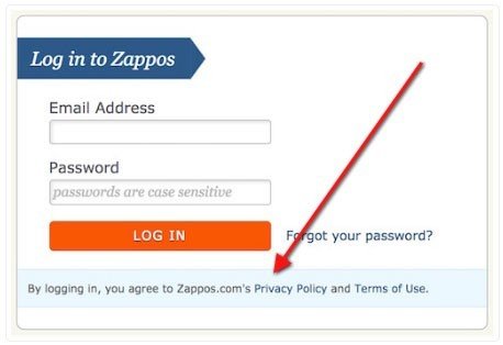
Consider the size of the font when making sure your legal links are noticeable. Your links to a Terms & Conditions or a Privacy Policy should be at least the same size as other links across your website, or larger.
You don't have to make them larger, but you cannot make them smaller.
Consider the font color contrast when making sure your legal links are noticeable. There must be enough contrast in the font color to make them actually stand out from the page.
This doesn't mean you need brightly colored crazy fonts. It just means not to put a light gray font on a white background or it won't stand out enough.
While the links to your legal agreement aren't adding anything decorative or innovative to your website and you may be tempted to bury them to make room for more fun stuff, don't do it. They need to be conspicuous to be enforceable.
2. What did you name your agreement links?
How you label your legal agreement links matters.
According to requirements by CalOPPA (the California Online Privacy Protection Act), the actual word "Privacy" must be used in your Privacy Policy link.
Your users need to be able to look at the link and know that clicking it will lead them to important legal information that can affect them (legal information they would want to know and need to know).
Naming your legal agreement something like "Terms and Conditions of Use" or "Privacy Policy Terms" is adequate and lets a user know that there's an important agreement behind the link.
On the other hand, naming the link something like "Printable version" or "Terms" is likely not going to be good enough to hold up in court if questioned.
3. Where are your agreement links placed?
Now that you know your links are a good size and color and are labeled in a way that will stand out on your website, it's time to consider where they're placed.
There are two main things to consider with placement:
1. First, the physical placement.
Where on your website are you placing your legal agreement links? Common placement is in website footer sections. Just be aware that where you place these links on a website may translate differently when viewed on a mobile device.
For example, the footer on page one of your website may actually be at the bottom of a few scrolled pages and not so readily visible on a mobile device. Here's an example of placement from Adobe that shows links to Privacy, Terms of Use, and Cookies agreements in the website footer:

2. The second thing to consider with placement is grouping.
What other links are around your legal agreement links? Your answer should be "not many."
Placing the links to Terms & Conditions and/or Privacy Policy too close along with other links can work to actually camouflage the links to these legal agreements and make them less likely to be noticeable, and thus less likely to be enforceable.
Make sure the links stand out from the rest of your links. This can be accomplished as easily as giving your legal agreement links their own column in your footer.
In the example above, Adobe places its legal agreement links in the right portion of the footer in their own little section.
However, here's how Facebook links some of its agreements in the footer of its register/sign-in page. Note how the links are grouped randomly with so many other links around them and they don't really stand out.

This isn't a big problem because:
- The links are in the footer, which is a standard place for users to know to look, and
- The links aren't any smaller or less vibrant than the other links around them, so they maintain equal prominence with the others.
While this type placement and grouping isn't the worst, there are definitely better ways to go about making your legal agreement links stand out while still blending in.
Opt for better grouping of your legal agreement links than you see in these examples here.
4. Do you use scrolling windows to display legal agreement text?
If no, you don't need to worry about this.
If yes, you need to consider the following factors:
How much text do you display in the visible portion of the scroll box?
The more text you display, the better it will be at catching a user's attention and putting him on notice that there's something there he maybe should be reading.TransUnion only displayed a few lines of text here, which was determined in Sgouros v. TransUnion to be inadequate.
Showing three sentences of an almost-10-page document isn't a successful way of showing your users that there's something important in that scroll box.
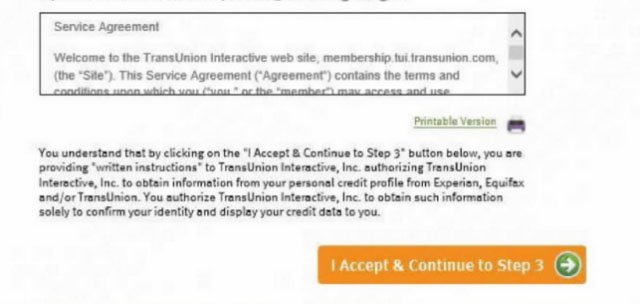
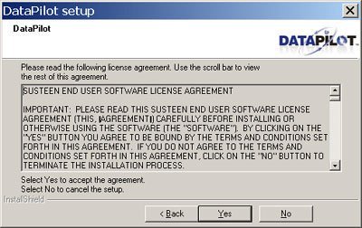
In contrast, notice how this scroll box displays at least 10 lines of text, making it look more important and giving users some information without them needing to scroll.
What kind of text do you display in the visible portion of the scroll box?
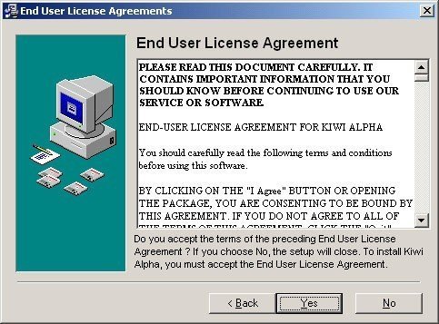
In other words, what can a user see without having to scroll that would let her know that she, in fact, should scroll and read what's in that box? It's very important that you put the most important terms somewhere where they're immediately or almost immediately visible, like at or towards the top of the scroll box.
This will mean that a user has the ability to notice the important text without needing to scroll or take any action.Note how in the example below, the first sentence of the scroll box text is ALL CAPS, BOLD, AND EXPLICITLY SAYS THAT IMPORTANT INFORMATION IS IN THE BOX.
This is a really effective way of making your terms stand out in the scroll box and get your users to notice.
Do you require a user to scroll all the way to the bottom before she can accept those terms?
While this isn't a requirement anywhere, doing so is a really easy and efficient way to make sure your Terms & Conditions and/or Privacy Policy is enforceable.
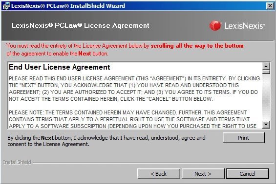
It's easy to prove that a user knew about your agreements and intended to accept them when that user is required to scroll to the bottom and take another action, such as clicking an "I Accept" button.This is called clickwrap.
Here's how LexisNexis gets readers to know that this scroll box contains important information, and a lot of it. A user must scroll to the very bottom of the agreement before being able to click the "Next" button.
Legal checklist for a redesign
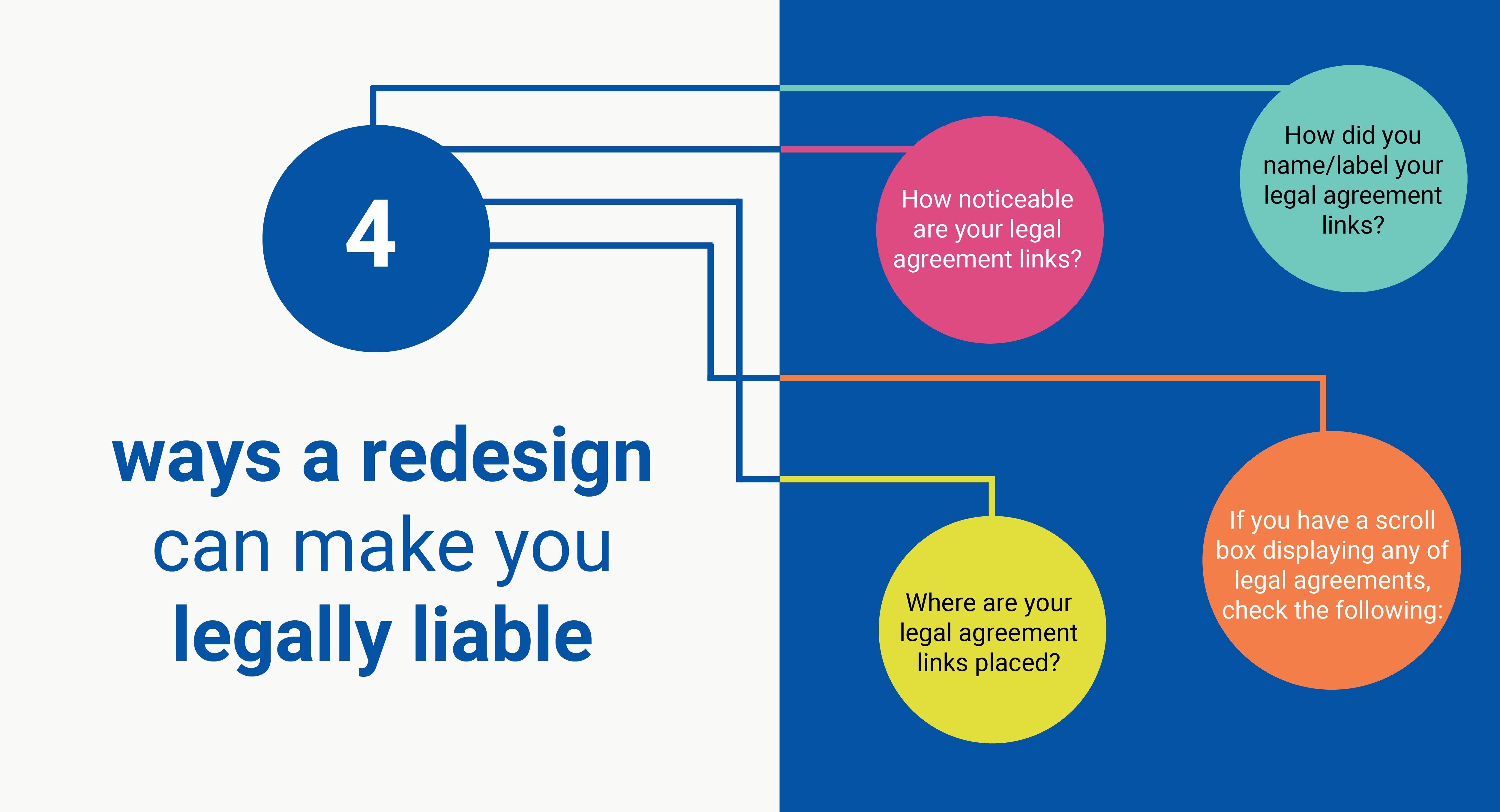
Consider the following factors to make sure your agreements are legally enforceable after a redesign of your website and/or mobile app:
- How noticeable are your legal agreement links?
- Don't use smaller font size
- Consider color contrasts that may camouflage your links
- How did you name/label your legal agreement links?
- Must be clear that the link is for something important (i.e. "Privacy Policy Agreement" is a good name, while "Link" or "Print this" is not).
- Where are your legal agreement links placed?
- Visually on the website: placement in the footer is standard. Anywhere easily noticeable and accessible will work. Don't bury at bottom of some arbitrary page.
- Grouped on the website: placement within a separate column or section close to but slightly separated is recommended. Just don't bury the links in with all the others.
- If you have a scroll box displaying any of legal agreements, check that you:
- Use bold or all caps text to draw attention to the legal agreement scroll box,
- Include more than just a few lines of text to make the scroll box more prominent on the page,
- Include important text at or towards the top of the agreement to make sure it's not missed and to put users on notice that the box contains important information for them, and
- Make users scroll to the bottom of the box before they're able to move forward with your website, whether creating an account, making a purchase, or other action that should be governed by your legal agreements.

Comprehensive compliance starts with a Privacy Policy.
Comply with the law with our agreements, policies, and consent banners. Everything is included.
