Earlier this year, the U.S. Court of Appeals for the Seventh Circuit held that in order for a legal agreement to be binding under Illinois law, a user of a website must be provided with reasonable notice that by using that website, and that clicking on a specific button, an agreement to the terms will be formed.
Sgouros v. TransUnion Corp
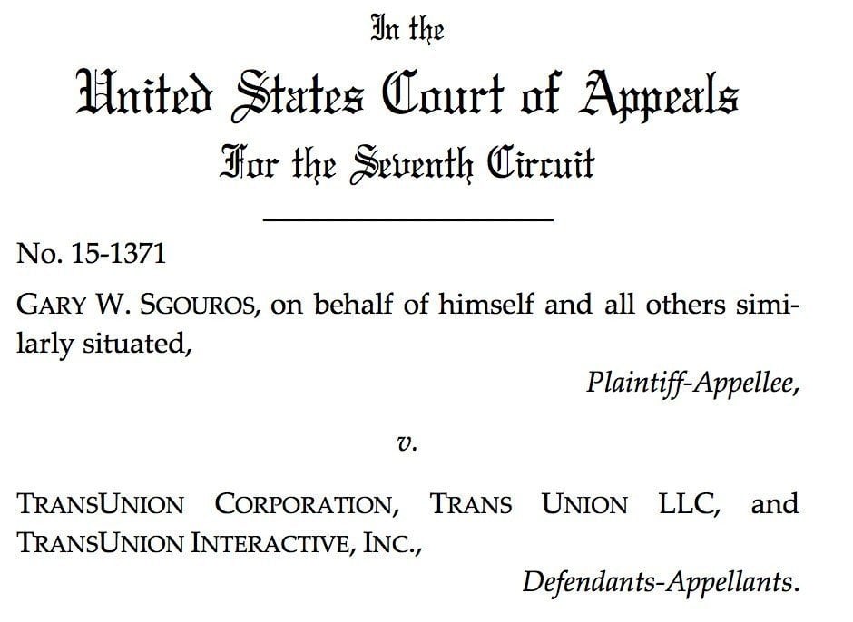
This ruling was the result of the case of Sgouros v. TransUnion Corp.
In this case, the plaintiff, Gary Sgouros purchased his credit report from TransUnion in preparation for attempting to obtain an auto loan. His TransUnion credit score as reported to him encouraged him to move forward with applying for the loan. However, when the auto dealership obtained his credit report, they found his credit score to be 100 points less than what Sgouros' reported TransUnion credit score was and he was denied the loan.
Sgouros believed he had wasted his money with TransUnion for a worthless, incorrect credit report and score and sued TransUnion for allegedly violating various state and federal consumer protection laws and for not disclosing that the formula used to calculate credit scores is materially different than the formula used by lenders when considering approving a loan or credit application.
TransUnion responded with a motion to compel arbitration based on the arbitration clause found in its legal agreement that required all users to arbitrate all disputes.
Ultimately, the court found that there was no agreement in place between Sgouros and TransUnion because there was no mutual assent.
This turned on factors such as the layout of the website, placement, and naming of the agreement hyperlink, and the specific language preceding the "I Accept" button that Sgouros clicked on to place his order with TransUnion.
It has long been recognized that a practically fail-safe way for website owners to obtain binding consent from users to be bound by the terms of the website is to implement a clickwrap method.
Clickwrap involves requiring a user to actively click - a checkbox or some form of "I Agree" button - to demonstrate actual consent.
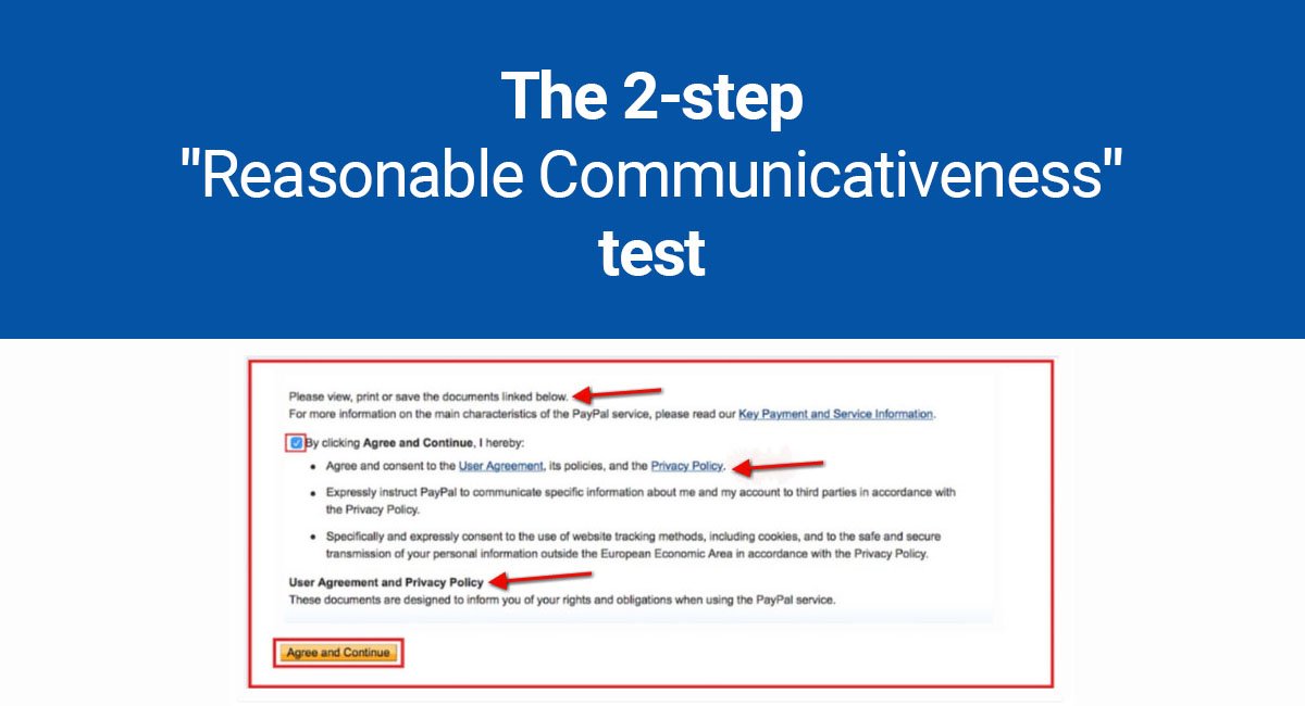
The agreements are also typically hyperlinked in this area, doubling to give notice to users that the documents exist and also providing convenient access:

While TransUnion did require a user to click a box that said "I Agree," the issue came in when the text before that box mentioned nothing about a service agreement.
Clickwrap only works if it is clear that your users are clicking to agree to your terms.
Having users click a simple "Sign Up" button constitutes sufficient clickwrap when the text immediately preceding the button makes it absolutely clear that by clicking the button, consent to a Terms and Conditions, a Privacy Policy and any other legal agreements will be created.

The court found that the format used by TransUnion was "actively misleading."
While TransUnion did use an "I Accept" button, which is a common and valid clickwrap method of obtaining agreement to terms, the button was associated with a block of text that said nothing about how clicking would be accepting any agreement, nor is there mention of any existing agreement.
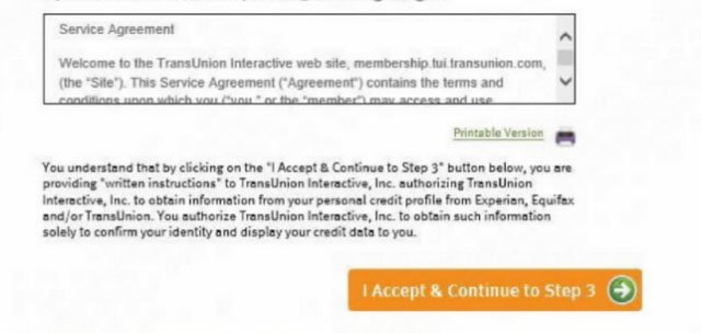
The text before the "I Accept" button from TransUnion stated:
You understand that by clicking on the "I Accept & Continue to Step 3" button below, you are providing "written instructions" to TransUnion Interactive, Inc. authorizing TransUnion Interactive, Inc. to obtain information from your personal credit profile from Experian, Equifax, and/or TransUnion. You authorize TransUnion Interactive, Inc. to obtain such information solely to confirm your identity and display your credit data to you.
Here's how it looked:
The "reasonable communicativeness" test
A two-step "reasonable communicativeness" test was applied by the court.
The two parts of the test are as follows:
- Step 1: Do the web pages presented to the customer adequately communicate all of the terms and conditions of the agreement?
- Step 2: Do the circumstances support a reasonable assumption that the customer received reasonable notice of the terms and conditions agreement?
The court stated:
This is a fact-intensive inquiry: we cannot presume that a person who clicks on a box that appears on a computer screen has notice of all contents not only of that page but of other content that requires further action (scrolling, following a link, etc.)[...].
We need, therefore, to look more closely at both the law and the facts to see if a reasonable person in Sgouros's shoes would have realized that he was assenting to the Service Agreement when he clicked "I Accept & Continue to Step 3.
Step 1
"Were the terms and conditions of the agreement adequately communicated? No."
There was nothing on the web pages where he completed his sale that informed Sgouros that his purchase was subject to some terms and conditions of sale.
The scroll box with the words "Service Agreement" visible within it wasn't enough to tell what the agreement regulated when it applied, and who it applied to.
The hyperlinked version of the agreement was just labeled "printable version," not anything specific or informative such as "Terms of Use" or "Our Agreement."
Step 2
"Do the circumstances support an assumption that Sgouros received reasonable notice of the agreement? No."
As the court stated, the language located above the "I Accept" button was very misleading.
Not only does this fact not support an assumption that Sgouros would know about an agreement, but it actually supports the assumption that Sgouros could have been reasonably certain that he was, in fact, not agreeing to anything other than exactly what TransUnion had included in the text, which made no mention of a legal agreement.
A binding contract requires mutual assent and a meeting of the minds. Because Sgouros cannot reasonably have been assumed to be aware that by clicking "I Accept" he would be agreeing to be bound by the terms of the TransUnion's Service Agreement, there's no binding agreement between the two parties.
This allowed Sgouros to proceed with a lawsuit and not have to use arbitration as alleged by the TransUnion company.
Examples
In order to get users to agree to your legal agreements (regardless if it's a Terms and Conditions, Privacy Policy or EULA) in a way that will be valid, enforceable, and pass the 2-step "reasonable communicativeness" test you have to:
- Communicate the existence of your legal agreements, and
- Make it very clear to users what they're agreeing to when they click "I Agree" or the equivalent.
This can be accomplished in a number of ways. Let's look at some examples of websites that would be incredibly likely to pass the 2-step test.
PayPal

Checking step 1 of the "Reasonable Communicativeness" test: Are the terms and conditions of PayPal's legal agreement adequately communicated?
PayPal communicates the existence of its legal agreements in a few different ways when users are taking steps to register and create an account.
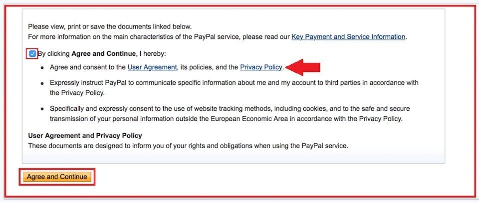
The first sentence of the registration section lets users know to "Please view, print or save the documents linked below." This shows that the documents are important and relevant to the user.
Links to the legal agreements are provided within the first section in the list of what happens when a user clicks "Agree and Continue."
At the end of this section, right above the "Agree and Continue" button, there is a sub-section titled "User Agreement and Privacy Policy" that says: "These documents are designed to inform you of your rights and obligations when using the PayPal service."
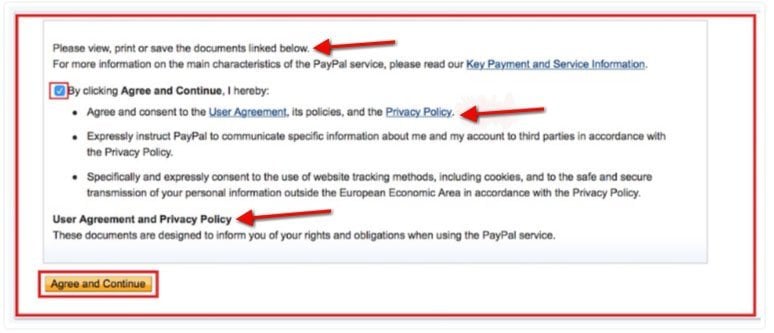
Users provided with conveniently accessible links to PayPal's legal agreements, but they're also informed that they should view, print or save these agreements and that the linked documents include information about rights and obligations directly affecting the user.
A court would almost certainly conclude that these facts prove that the existence of the legal agreements is communicated with users.
Note the difference here from how TransUnion provided its legal agreement as a standalone link without any indication that it was important, and without stating anywhere that a user would be agreeing to the terms found within.
Checking step 2 of the "Reasonable Communicativeness" test: Do the circumstances support a reasonable assumption that PayPal' users will know what they're agreeing to?
PayPal makes it very clear to users exactly what they're agreeing to when they click "Agree and Continue."
Users are required to click a checkbox as well as an "Agree and Continue" button.
The checkbox is placed at the beginning of a list and directly after the checkbox is text that states, "By clicking Agree and Continue, I hereby:" The list then follows and the "Agree" button is at the very bottom of the list.
This format makes it practically undoubtedly that a user will understand that by clicking "Agree and Continue," certain things will happen, including agreeing and consenting "to the User Agreement, its policies, and the Privacy Policy" and other items in the list.
Slack

Checking step 1 of the "Reasonable Communicativeness" test: Are the terms and conditions of Slack adequately communicated?
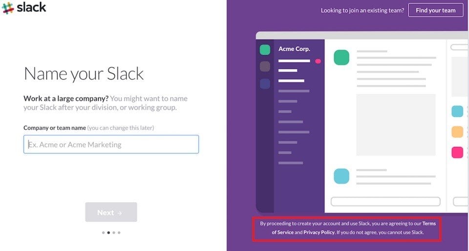
Slack communicates the existence of its legal agreements to users as they create a Slack account by including a disclaimer:
by proceeding to create your account and use Slack, you are agreeing to our Terms of Service and Privacy Policy. If you do not agree, you cannot use Slack.
Links to both agreements are provided in this disclaimer. Users are essentially put on notice that there are important terms that may affect them if they continue to use Slack.
Checking step 2 of the "Reasonable Communicativeness" test: Do the circumstances support a reasonable assumption that users of Slack will know what they're agreeing to?
By stating that Slack cannot be used if a user doesn't agree to the terms makes it clear that by continuing to use Slack, consent to the terms can be assumed. If a user clicks to move forward with registration and continues to use Slack after being given this notice, this will likely hold up in court as forming consent.
The notice by Slack is probably clear enough to let users know what they're agreeing to when they create their Slack accounts.
However, using a checkbox or something that requires a more active and overt action by a user is always the preferred method of obtaining agreement.
Drupal

Checking step 1 of the "Reasonable Communicativeness" test: Are the terms and conditions of Drupal adequately communicated?
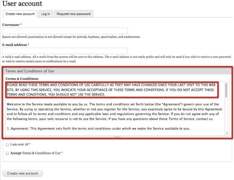
When a user creates a new account on Drupal, its "Terms and Conditions of Use" agreement is embedded directly within the account creation page via a scroll box.
The first few paragraphs of this Terms and Conditions of Use can be seen, and a user can easily scroll through the document directly from this box without having to click on another link.
This makes it very clear to a user that a legal agreement exists, as it's already partially visible.
However, remember that TransUnion also provided the first few sentences of its Service Agreement in a scroll box, which was not good enough.
The difference here is that Drupal uses the visible text to draw attention to the document by using all capital letters and stating that:
by using this service, you indicate your acceptance of these terms and conditions. If you do not accept these terms and conditions, you should not use the service.
TransUnion's scroll box had nothing visible that showed any sort of urgency or importance like capital letters or strong language.
Checking step 2 of the "Reasonable Communicativeness" test: Do the circumstances support a reasonable assumption that Drupal' users will know what they're agreeing to?
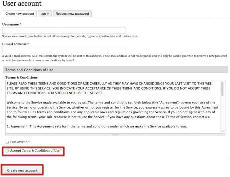
Users must click a checkbox next to a statement that says, "Accept Terms & Conditions of Use" before being able to create a new account.
This leaves little doubt that a user who clicks that checkbox and then continues to create a new account intends to accept the Terms.
The issues in Sgouros v. TransUnion could have easily been avoided if the linked agreement was given context and made to stand out more as being important, and if the paragraph before the "I Agree" button was accurate.
In sum, if you want to make sure that you're as compliant as possible with the 2-step "reasonable communicativeness" test, these tips can help:
- Communicate to your users that
- You have legal agreements, and
- These agreements are important to the user
- Provide links to your legal agreements that
- Are easy to locate, and
- Have text around them to provide context as to why a user should click on the link.Just putting a hyperlink for "Terms of Use" off to the side of a registration page with no mention that "You will be bound by the Terms of Use linked here" may not be considered informative enough by the courts.
- Use clickwrap.Make users click a checkbox as well as an "I Agree" button to continue.
-
Be clear on what a user's clicking is accomplishing.Consider the PayPal example above.
Make sure a user knows that a click in your checkbox means what it means and that by clicking "I Accept" or the equivalent, the user is actually accepting terms and will be bound by them.
Place this language directly above or before the "I Agree" button so that there's no confusion or doubt as to what that agreement is for.

Comprehensive compliance starts with a Privacy Policy.
Comply with the law with our agreements, policies, and consent banners. Everything is included.
