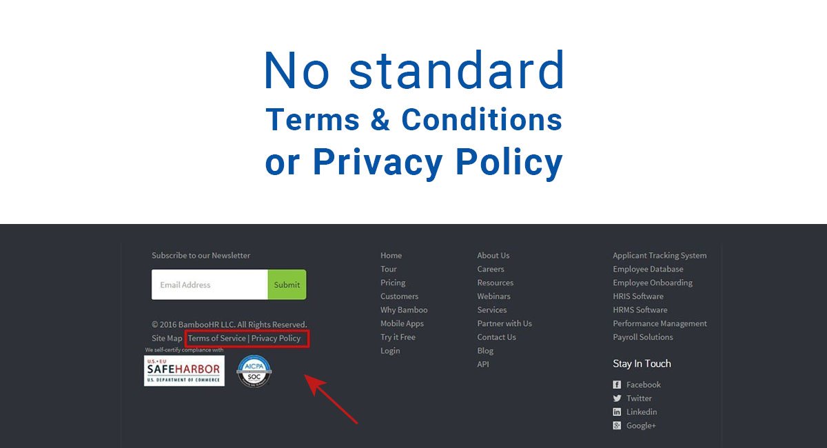
Online forms are a great way to collect important information from visitors and users of your website.
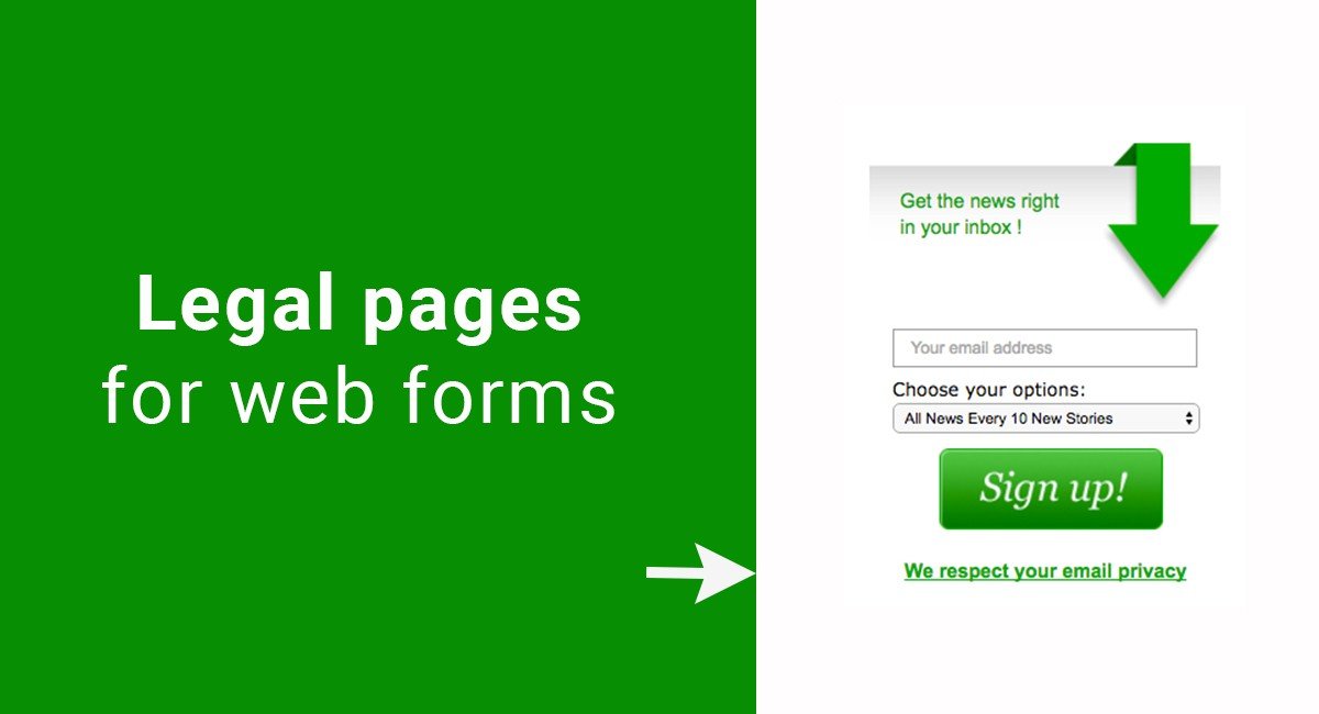
A basic online form would be a form in a pop-up box that collects email addresses of people who visit your site and wish to subscribe to your email newsletters.
If you collect any personal information in a web form, even if just an email address like in these examples, you are legally required to include have a Privacy Policy on your website and/or mobile app.
It's not mandatory to include your legal agreements near where the web form is located, but the legal agreements must be accessible to users.
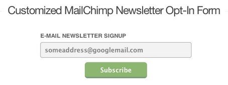
The example of the basic form below that simply asks for a user's email address:
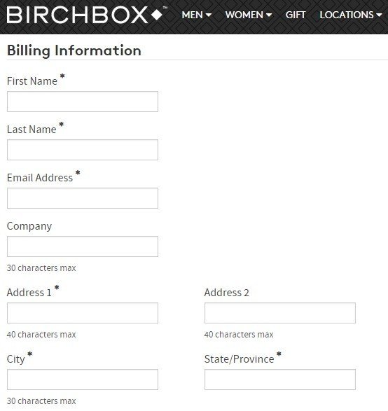
An example of a more complex online form is a registration form for a paid subscription service.
The image below is from the Birchbox account sign-up page. After filling out home address information, a user is asked for billing and financial information:
Whether your form collects just basic personal information or asks for pages of information from users, you are always required to collect this information in a legally compliant way.
For websites and mobile apps, this means 3 things, each of which will be discussed in greater detail, as well as in specific scenarios, throughout this article:
- You must have the correct legal agreements created and placed on your website or mobile app.
If you collect any personal information, a Privacy Policy is legally required.
A Terms and Conditions may be recommended depending on the web form being used.
- You must make sure these legal agreements are easily accessible. Attention should be paid to where you place links to your legal agreements in web form.
- You must make sure that adequate information is included in the legal agreements, such as what data is being collected and why.
Disclosure and accuracy are very important when it comes to staying compliant with privacy laws.
While the specifics of the information in your Privacy Policy will change depending on what type of personal information your web form collects, you'll always need to include the following information:
- What personal information you are collecting
- How this personal information is collected
- Why this personal information is collected
- How this personal information is used by you and, if applicable, by any third parties
Now, let's discuss a few of the most commonly used or encountered web forms - Contact forms and Registration forms. For each form we will cover the following:
- What legal agreements are recommended to use
- What the best and most effective positioning is for the links to legal pages on your web forms
Example of web forms
Contact forms
Contact forms are used by websites and mobile apps to make it easier for users to contact the website owner or the team behind the website/mobile app.
Typical contact forms have fields for the user's name, email address, and room for a message that the user wishes to convey to the website operators. The most basic information required from a user in order to be able to contact the user with a response is typically all that is or should be requested on a contact form.
Additional fields may be requested, such as the city the user is located in, as seen in the example below.

Note how in the example below, a phone number field is listed, but marked as being not required. This gives users options as to how much information beyond the basics (name/email address/message) they wish to provide.
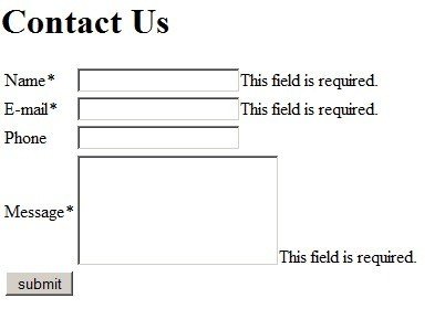
A Privacy Policy is adequate to be used here, and not a Terms and Conditions agreement.
In your agreement, let users know why you need each of the pieces of requested information, and how you will use this information. Disclose if any third parties may have access to this information.
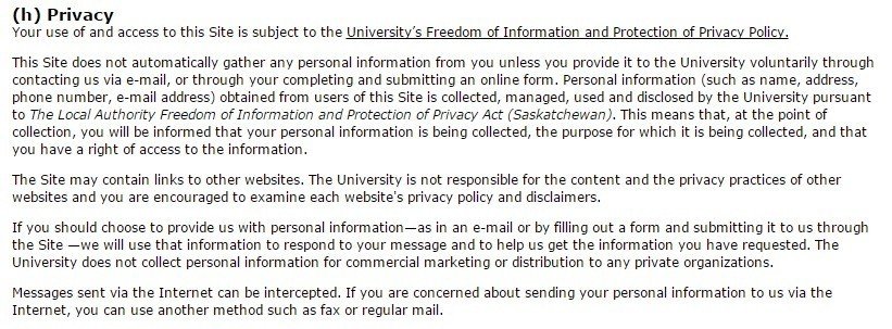
Below is an excerpt from the Privacy Policy of University of Regina that has a section covering personal information.
It says:
if you should choose to provide us with personal information - as in an e-mail or by filling out a form and submitting it to us through the Site - we will use that information to respond to your message and to help us get the information you have requested. The University does not collect personal information for commercial marketing or distribution to any private organizations.
This lets users know how their information will be used, and how it will not be used:
Where should you place the links to your legal pages on your contact web form to make them the most effective?
There are 2 favored positions where you should consider placing links to your Privacy Policy.
The first is at the top of the page, or early in the web form design to ensure that a user notices it quickly and before any information has been submitted.
Below is a randomly generated example of how a website could place a box with information in it at the top of a web form.
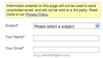
Note how the information box provides a short but to-the-point summary by letting users know right away that "Information entered on this page will not be used to send unsolicited email, and will not be sold to a 3rd party."
A link is provided to give access to the rest of the Privacy Policy and is very noticeable.
The second favored position where you should consider placing links to your Privacy Policy is near the CTA button, or call-to-action button. For example, the Submit button in the example below is the CTA button:
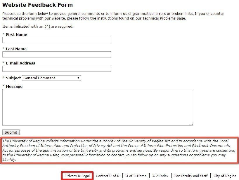
Note how there is a long informative paragraph near the CTA button.
The information in this paragraph in part states that "by responding to this form, you are consenting to the University of Regina using your personal information to contact you to follow up on any suggestions or problems you may identify."
This paragraph also lets users know that different legal bodies are being followed (the University of Regina Act, the Local Authority Freedom of Information and Protection of Privacy Act, etc.).
A link to further "Privacy & Legal" information is provided close to this paragraph, which helps users notice that there may be other relevant privacy information they would be interested in knowing.
Don't place links only at the very bottom of the page like in the footer above. Without additional emphasis placed on the link to the Privacy Policy at the bottom of the page, the link would be very difficult to notice for most users and wouldn't be very effective.
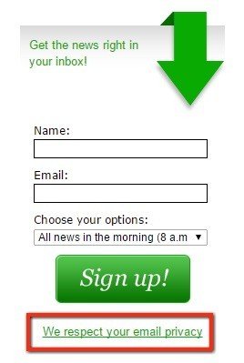
The image below shows the email subscription form for users who wish to sign up for email newsletters from the Health Impact News website. The form has a link at the bottom that lets users know that information is available to them about issues of privacy if they click the link.
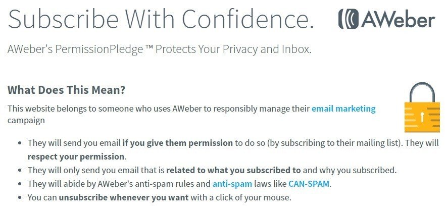
Clicking this link takes a user to a very clear and basic summary page about how an email address will be used, and how to unsubscribe in the future.
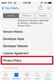
For mobile apps, include your Privacy Policy in the general information section of your app so that users can access the policy before downloading or interacting with your app at all. This ensures that users are aware of what will happen with their personal information before they share any.
Here's an example from Facebook of how a Privacy Policy should be included in app information in an App Store:
Registration forms
Registration forms are typically far more comprehensive than contact forms, and thus typically collect far more personal information than a contact form would.
Registration forms also play a very important role: registered users are given access to separate and special sections on a website or mobile app that non-registered users are not able to access.
Registration forms collect information that is used to create a special agreement between users of a website or mobile app and that website or mobile app itself.
Is a legal agreement beyond a Privacy Policy recommended for a registration form?
Yes. A Terms and Conditions is highly recommended for websites that provide users with the ability to register and thus access a separate section of the website than non-registered users have access to.
This agreement is where you can list all requirements and limitations that you have for registered users of your website, as well as protect your website from abuses.
For example, you can limit use of your website to personal use and not allow commercial use, and reserve the right to block a user from your website if this or any other limitation is violated.
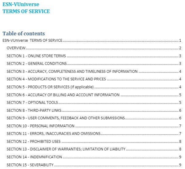
Below is the table of contents from the Terms of Service of ESN-VUniverse.
Notice how many topics are covered and are within the scope of the Terms, from Billing and Pricing Modifications to Prohibited Uses.
You are able to include as much information in your Terms as you want regarding the general use of your website or mobile app.
While Privacy Policies are good for telling users how their privacy is protected, a Terms and Conditions agreement covers everything else that you would want to be covered.
Where should you place links to legal pages on your registration web forms to make them the most effective?
The registration form should include information about your Terms and Conditions to ensure that users who are registering are aware that this agreement exists, and know that they are agreeing to the terms and rules from the agreement.
Without this notice, it will be difficult to prove that users agreed to your Terms and Conditions since they may not have even known such a legal agreement existed.
Put links to your Terms and Conditions close to the CTA button. Make this the last thing the user will see before taking the final step and clicking Submit/Register/etc. and make it clear that the user is agreeing to these Terms by continuing to complete the registration process.
Note how Facebook's Sign-Up/Registration form has clear language towards the bottom of the form right before the Sign-Up button, that states, "By clicking Sign-Up, you agree to our Terms, and that you have read our Data Use Policy, including our Cookie Use."
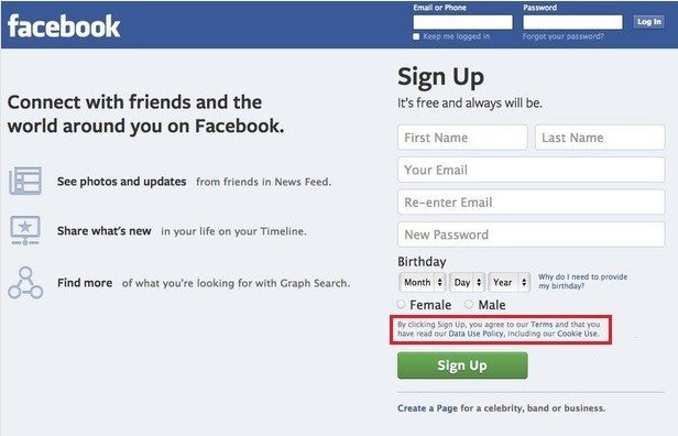
The same standards should be applied to mobile apps and not only websites.
Instagram's mobile app provides links to their Privacy Policy page and Terms of Service page, and also state that by signing up/registering, a user is agreeing to these legal agreements:

Go one step further with your registration form and require users to actually check a box to acknowledge that they are aware of and agree to your Terms and Conditions.
This is known as the click-wrap method of obtaining agreement to your Terms, and it holds up in court very well.
Below is an example of how to obtain more active, click-wrap acceptance of your legal agreements by users who are in the process of registering.
Have users click this box right before they click the "Sign Up" button for very clear acceptance:

After a user has registered, you can include links to the Privacy and Terms agreements somewhere in the login section just as a regular reminder to your registered users that these are the legal agreements that apply to them.
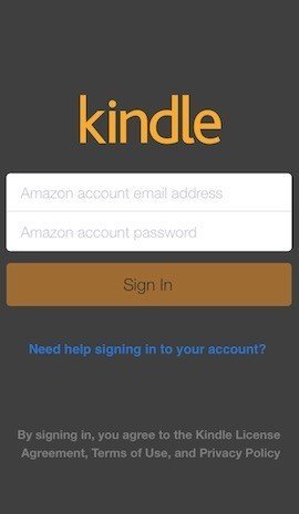
However, this is not required, but it makes it easier for your users to know what's going on with their personal information, as well as what you expect from them when using your website or mobile app.
When you use a web form that collects any personal information at all from your users, you must, by law, have a Privacy Policy.
If you allow users to register for your website, you aren't required to have a Terms and Conditions agreement but you absolutely should.
Always place links to any legal agreements very close to the CTA button so that a user will notice the links before submitting their information to you. This helps ensure that users clearly know they are accepting your legal agreements.

Comprehensive compliance starts with a Privacy Policy.
Comply with the law with our agreements, policies, and consent banners. Everything is included.
