The following are crucial factors when it comes to getting valid and enforceable agreement to your website or mobile app Terms and legal agreements:
- How enforceable your Terms and Conditions or Privacy Policy agreements are
- Where you place the "I agree to" checkbox to obtain consent and agreement, and
- What language is placed next to that checkbox
Legal Cases
Two plaintiffs in a class action lawsuit against Guthy-Renker both had very different outcomes based on placement and structure of language that was intended to bind the individuals to Renker's Terms and Conditions agreement.
The Guthy-Renker website had been redesigned in the time between when each plaintiff interacted with the website, and this redesign made a huge difference.
In the case of Friedman versus Renker, the final checkout screen during the time of Friedman's purchase had very unclear placement and language for the checkbox that works to bind a purchaser to the terms of the website.
There were two lines of text and a checkbox that were very close to the bottom of the page. The text immediately above the checkbox said: "By checking this box, you are electronically signing your order and authorizing us to charge payments against credit card provided above."
The label on the checkbox said: "Agree to terms" and the box had to be checked in order to complete the purchase. The link to the Terms and Conditions agreement was provided, but in an offset frame under a Helpful Links menu with a number of other links.
In the time between Friedman's purchase and plaintiff Henry-McArthur's purchase, the website was changed in two very important ways.
The language that was placed directly next to the interactive checkbox stated "Agree to Terms and Conditions" and is underlined, hyperlinked to the agreement, and is in bold font.
All language that mentions credit card authorization is separated from this section and is placed after it, separating the need to agree to Terms and Conditions, as well as agreeing to the credit card authorization.
In the Friedman case, the court placed the most emphasis on where the text that worked to create an agreement was placed in relation to the checkbox that would prove the agreement.
By placing the checkbox directly after the credit card authorization information, and by not capitalizing the word "terms" to imply a separate Terms component, the court found that a person could reasonably believe that by clicking the checkbox, the user was simply agreeing to the credit card authorization.
Because of this, Friedman was not bound to the Terms and Conditions on the Guthy-Renker website.
Henry-McArthur was determined to be bound by the Terms and Conditions due to the adequate changes that had been made to the website between the Friedman and Henry-McArthur purchases.
These cases provide important information about where you should place any "I agree to" checkboxes, and how the language surrounding these boxes should be structured.
Where and How to Place the Checkbox
Suggestion 1: Prominently
The more prominently you place the checkbox on your site, the better. Give it its own space and don't crowd other images or text around it. You want it to stand out and be noticeable as its own component.
This is exactly what Engine Yard does by linking to the Terms of Service agreement when users are creating an account:

Suggestion 2: Early on
It makes sense to put the checkbox as close to the beginning of a transaction, website registration, or website use as possible.
In the Friedman case mentioned earlier, the checkbox was at the end of the transaction page, and while this is ok, this low-priority placement combined with the low-impact text was just not good enough.
If you don't make users agree to your Terms and Conditions agreement as soon as they start using your website or mobile app, you should make it clear when you are asking them for consent.
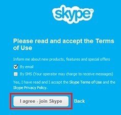
Note the way that Skype requires a user to very clearly and actively agree to its Terms of Use page and its Privacy Policy page before being able to use Skype.
This is a great way to bind users to your Terms and Conditions with no room for doubt or uncertainty.

Suggestion 3: Clearly
Make sure that any language that describes what checking the box means for the user is made clear and is obviously associated with the checkbox. If the statement that goes with your checkbox can mean anything other than what you're intending it to mean, rewrite it.
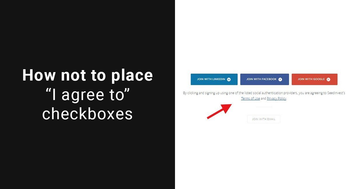
Leave no room for confusion. Look at this example from SeedInvest:

Notice there is language that states: "By clicking and signing up using one of the listed social authentication providers, you are agreeing to SeedInvest's Terms of Use and Privacy Policy."
While this would typically be a great way to alert users that they are about to become bound by a legal agreement, notice that the "Join With Email" box below this does not have any language about a Terms of Use or a Privacy Policy.
Does this mean that a user who signs up through email is not bound by the Terms of Use of SeedInvest, and the Privacy Policy doesn't apply either?
Avoid anything such as this that would be unclear to a user, or a judge in a courtroom.
Suggestion 4: With emphasis
Don't make the mistake that Guthy-Renker made by mentioning your Terms and Conditions agreement as just "terms."
These terms are important to both operators of websites or mobile apps and the people who are agreeing to the terms. Place emphasis on the fact that "Terms and Conditions" are being agreed to, and not just any old terms.
Use underlining, capital letters, bold font, and hyperlinking to show a user that these terms are TERMS.

Comprehensive compliance starts with a Privacy Policy.
Comply with the law with our agreements, policies, and consent banners. Everything is included.


