Having a good "About Us" page can have a number of pretty amazing benefits for your business, including:
- Making your company seem more trustworthy,
- Giving you a human element and heartfelt relatability that consumers seek,
- Providing a platform to tell your story,
- Differentiating you from your competitors
Beyond the "About Us" page, other important elements of a website that can increase user trust are a Privacy Policy and SSL certificates for example.
Having a Privacy Policy in place lets users know how you collect and use personal information from them, while an SSL certificate lets them know that any information being collected is secure and that your business is technically and functionally trustworthy.
However, while Privacy Policies are required by law in most countries and an SSL certificate may not be something that most website users are aware of, the "About Us" page isn't required by law.
As a result, the "About Us" page is a good example to gain trust.
How to write your "About Us" page
Writing your "About Us" page on your website can be fun and enjoyable. The page is a space for you to get creative, personal, and basically initiate a personal introduction with your customers.
Here are 6 points to remember when creating your "About Us" page so that you'll make the most positive impact possible and win over your customers' hearts and their business.
Be factual
The "About Us" page is a way to earn trust and there's no quicker way to lose that trust than to be caught lying to the public.
Make sure that any claims you make, the information you divulge or the things you say in your "About Us" page are actually true.
Write in a friendly style, but tailor it for your audience
Take a really good look at who you're writing for. While the rule that you should tailor your website writing to your client base stands true for all areas of your website, this is perhaps most important in the "About Us" page.
This is because on this page is where you'll relate to your customer in a personal way and win over customers.
You can have the best product ever for a new mom, but if she doesn't trust the way you portray your company in the "About Us" section, she probably won't buy it.
Likewise, a CEO of a Fortune 500 company may be considering your product, but if your "About Us" page isn't written with enough of a professional tone of authority, you may lose that enterprise customer to a different company that does the same thing as you but talks about it better.
Don't use a lot of jargon in your "About Us" page
Write simply and clearly, in a friendly and realistic tone that you know your specific audience will relate to and appreciate.
Put important things first
People have short attention spans and you won't have much time to either win them over or lose them to another company.
Think about what the most important things you want to convey are, and put these things first.
Use formatting
Another thing you can do to help present information effectively and help keep a reader's attention is to use formatting.
Write short and simple sentences, shorter paragraphs, and use things like bullet points, images to break up text, and different sized or bold font.
Little things like breaking up a paragraph or turning a longer sentence into a bullet-pointed list can go a long way when someone's reading your page.
Be personal, authentic and heartfelt
Tell your story. Be real. Like we said earlier, the "About Us" page is the place where you get to differentiate your company and your products from every single other similar company out there in the world.
Here's where your personal story can make all the difference. People love seeing the story behind the outcome. Ask yourself:
- What or who inspired you to create your company or your products?
- What are you adding or hoping to add to the world with your company or products?
- How has your company/products changed your life and the life of those around you?
Get personal, and be real.
You won't lose credibility with people for being a huge, reputable company now that was in the past a part-time basement hobby.
In fact, quite the opposite. People love a success story, and love to support things they can relate to.
Get in touch with what inspired you and tell it in a way that can inspire others, and it more likely than not will do just that.
Use pictures, or even videos
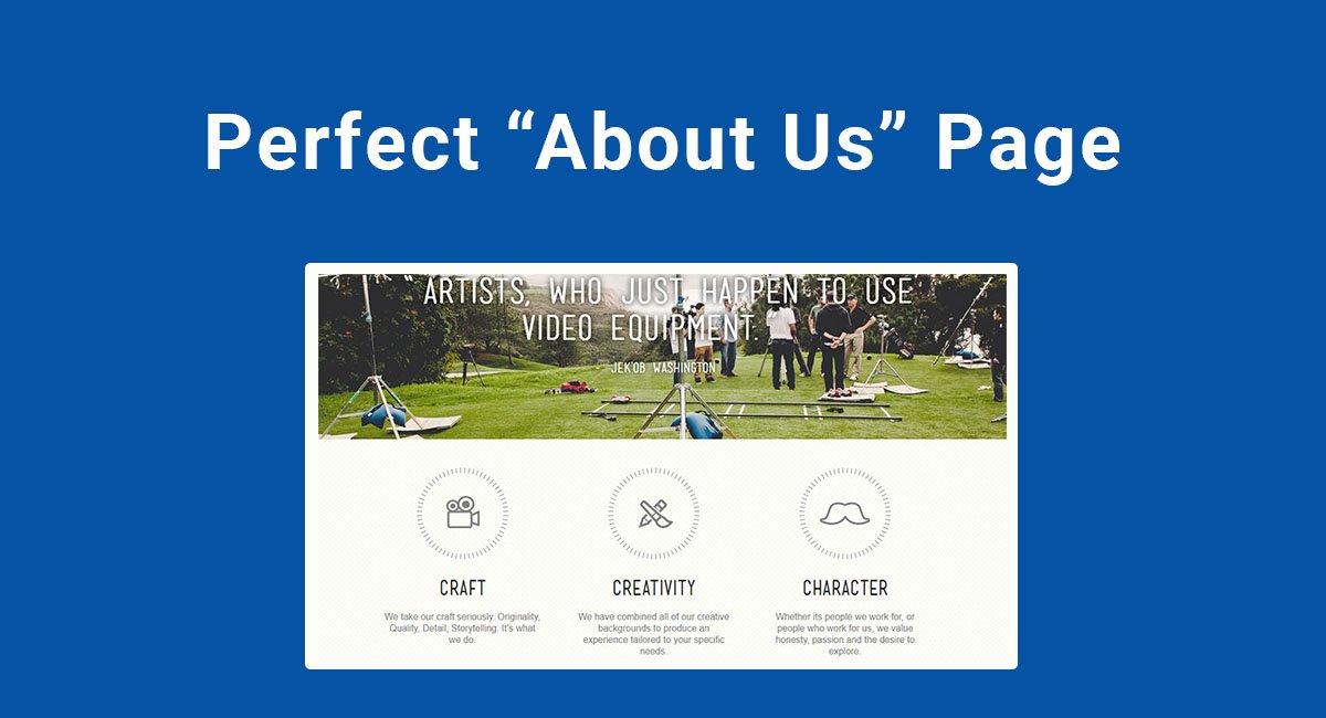
Consider adding a picture or even a video of behind the scenes at your company, or something that shows who and what you're all about. Even an artistic picture of your top-selling product can make your "About Us" page stand out from text-only pages.
Use real people. What do your employees and customers say?
People relate to people. When you're selling a product or service, the best way to make people see how it can benefit them and be used in their own lives is to do just that: show them how it benefits others and is used by others, just like them.
Customer testimonials are a tried and true way to demonstrate the effectiveness and popularity of a product. Call on your customers to submit testimonials that you can then use to let their talking speak for your product.
It also helps build trust in a company and give faces to the name when you showcase your employees on your "About Us" page. Your customers will enjoy seeing that glimpse into your company, and it will remind them that there are real people behind the product.
Examples of "About Us" pages
Let's take a look at some "About Us" pages from various companies that do a fantastic job of presenting themselves to the world.
Copyblogger

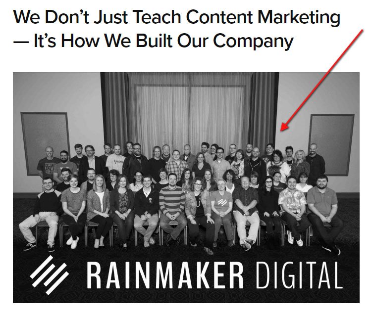
Copyblogger's About Us page starts with a group picture of the entire company. This right off the bat gives a reader a sense of community with the company.
You can look at the entire crew, see their smiling faces, casual attire, and oneness.
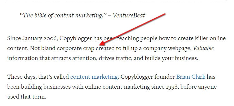
The language used by Copyblogger on their "About Us" page is cool, casual, and almost comedic.
You find out that "since 2006, Copyblogger has been teaching people how to create killer online content. Not bland corporate crap created to fill up a company webpage."
Copyblogger makes it clear right away that this is a group of real people who you can actually look at, that will steer you away from the "crap.":
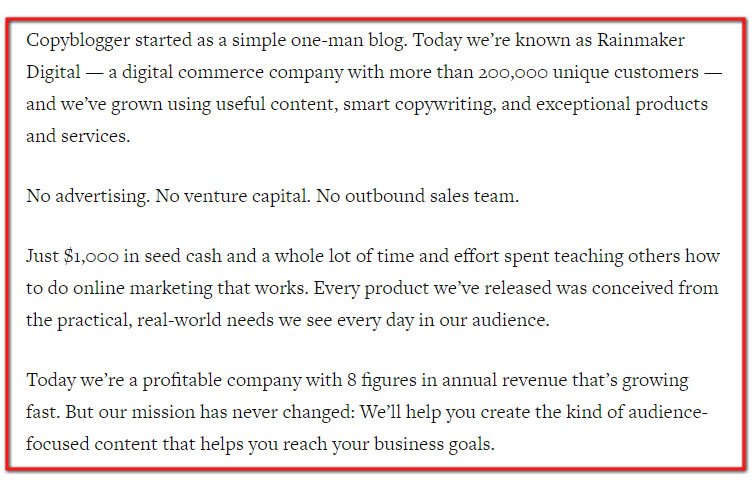
After setting the tone, the story is told. We find out that the company started out as a one-man blog and now is an 8-figure company with over 200,000 customers. That's impressive, but not boastful:
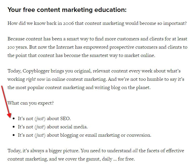
There's use of good formatting with paragraphs being short, and sometimes even just one standalone sentence. Bullet points are also used:
A "call to action" button at the end of the "About Us" is a really smart idea so that when your readers are done reading the page, they can immediately sign up or shop on your website.
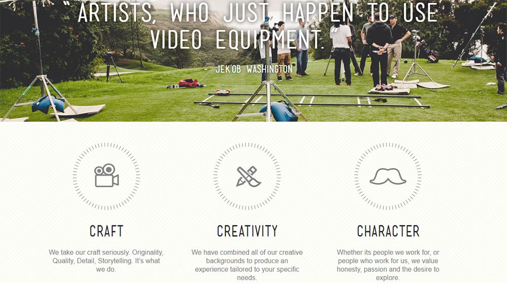
FortyOneTwenty

FortyOneTwenty's About Us page focuses heavily on visual appeal and to customer satisfaction. Sharp graphics and a colorful integration of customer testimonial quotes with eye-catching images works to give a modern and friendly feel to this page:
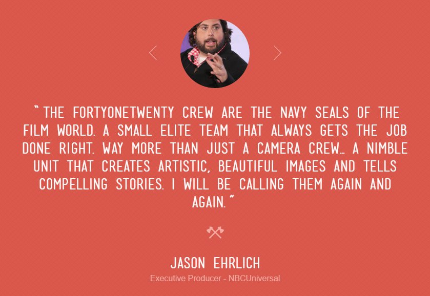
Different clients and customers have their testimonials showcased, along with their pictures. This brings a name and face to the testimonials:
Each company that works with FortyOneTwenty is featured at the bottom of the "About Us" page in the "Trusted By" section. A unique icon is used for each company or brand, which looks sharper than just a list of the company's names would look.

HubSpot

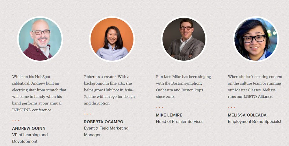
HubSpot's About Us page really showcases its employees in a warm and personal way. The heading of "People at HubSpot" is followed by a sentence that says, "The best thing about coming to work are the people we solve challenging problems with every day."
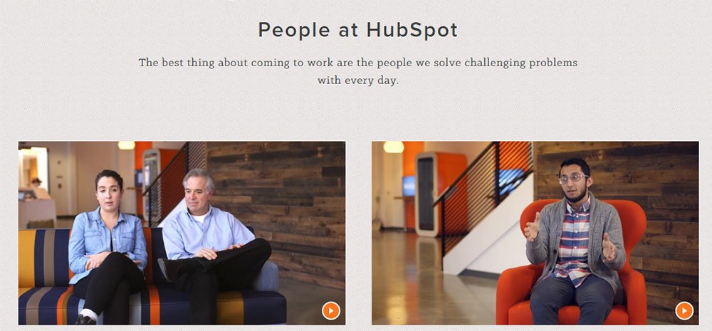
Videos where you can see the employees in action follow, and then employee images and interesting little facts follow this, which really gives a face and personality to the employees of the company.
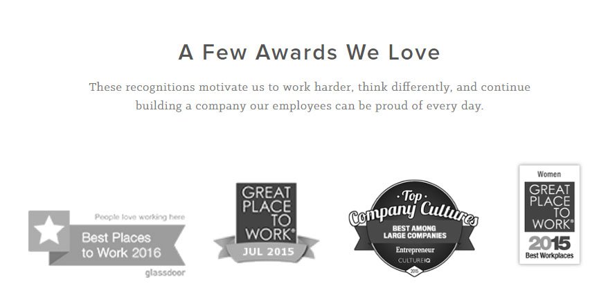
Awards are also showcased here so you can see the accomplishments that the people you've just been introduced to have achieved.
Nubian Heritage
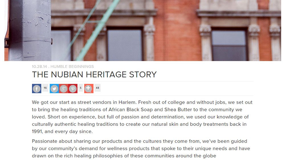
Nubian Heritage has an interesting multi-tiered approach for their "About Us" page that they've titled "Humble Beginnings".
When you click on the "Humble Beginnings" tab on their main navigation menu, you'll get three different options. You can read more about the story, watch a video about the Nubian Heritage way, or read more about the founders themselves:

The "Nubian Heritage Story" link takes you to a summary of the brand that tells of its roots and how it became a company. You get a feel for where the passion comes in and learn about how small of a beginning the company had.
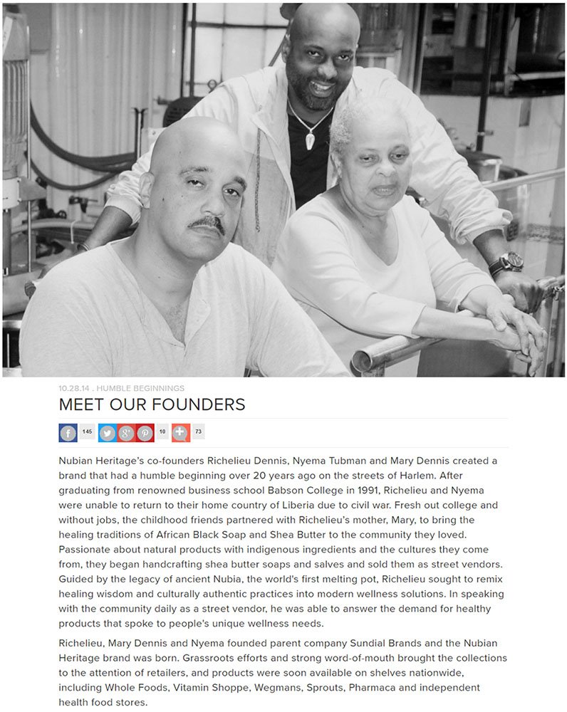
When you check out the "Meet Our Founders" page of Nubian Heritage, you get a black and white image of the founders, and a lot more personal information about who they are:
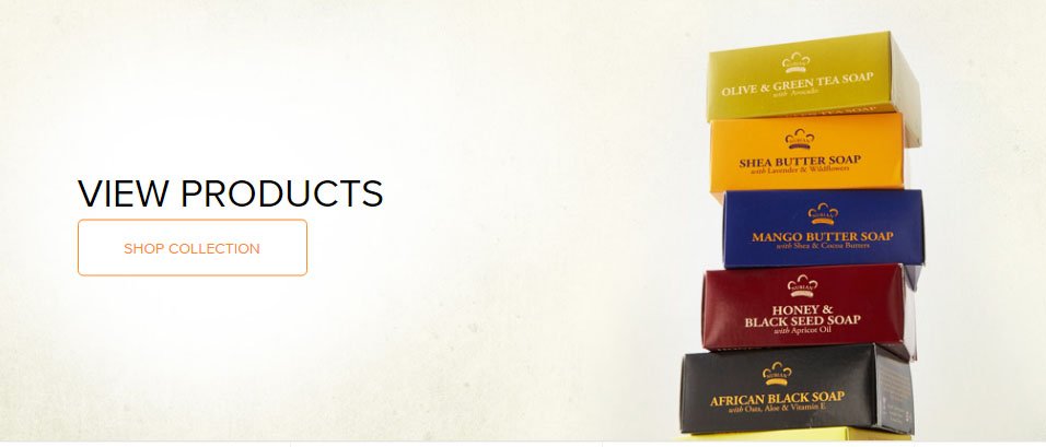
At the end of each section from Nubian Heritage's "About Us" page is a place where customers can quickly start shopping. This is an easy call to action for customers:
Yellow Leaf Hammocks
Another company with a story to tell that they tell so well is Yellow Leaf Hammocks.
If you have a lot of information you want to get across in your "About Us" page, such as what are the company's values, the products the company sells, the inspiration story, consider this example from Yellow Leah Hammocks.
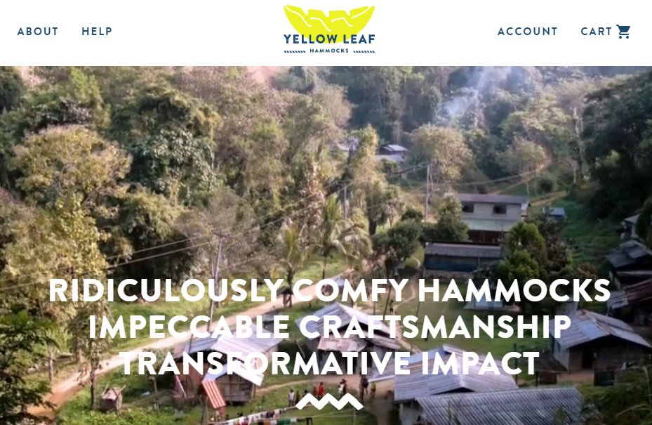
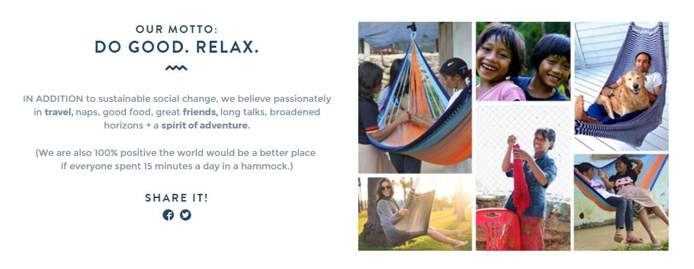
The company uses short text and colorful, warm images to really convey their motto and their mission. They talk about relaxing, creating sustainable social change, and spreading positivity. You can't help but feel good looking at the images there.
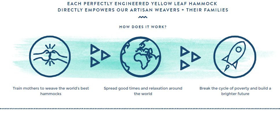
Keep scrolling and you'll see a super simple infographic that tells how these hammocks are making social change. Mothers are trained to make the hammocks that are then sold globally, and they're given a skill and an opportunity to get out of poverty.
Pictures of the mothers themselves are shown, with a link where you can learn their story.

This brings heart and a personal touch to the hammocks that really makes you appreciate the brand and what they're doing to help others. Everything is explained very simply, while bright colors and the emphasis on relaxation and doing good makes this a very positive-toned page.
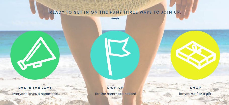
The call to action at the end of the "About Us" page is very well done with options for more than just shopping. You can also share the word on social media, or sign up for their email newsletters right from the page:
Jared Christensen

It isn't only big companies with big missions that can have great "About Us" or in some cases, "About Me" pages.
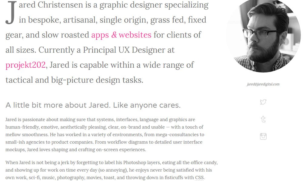
Check out how graphic designer Jared Christensen makes his website's About page a flowing blend of personal, professional, and pretty humorous by adding professional credential facts in with bits of personal information and and personality.
Moz

The Moz About page uses a graphical timeline to show exactly where the company is today and what the notable events in its history have been, from its founding in 2004 to today.
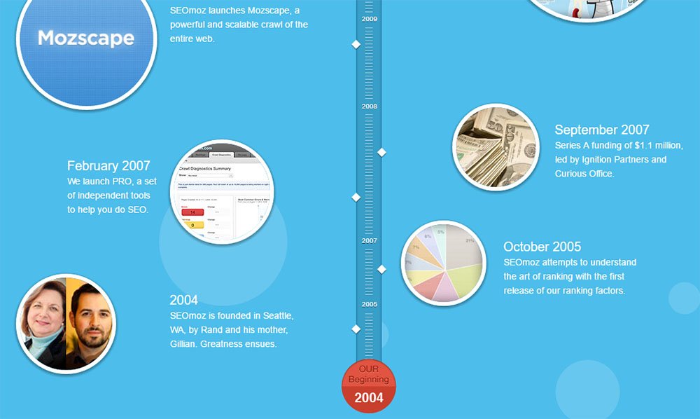
As you can see, there definitely isn't a one-size-fits-all format for your "About Us" page.
The common goals for this kind of page, regardless of what you're trying to sell, from hammocks to yourself (in a legal way), are to:
- Gain a reader's trust,
- Tell an interesting, factual story about your brand,
- Bring some personality to your company,
- Talk in a tone your readers would want, and
- Have fun sharing your inspiration or goals with the people who are helping make that a reality.
Your company is different than everyone else's, even if it maybe seems like it isn't. Capture what it is that makes you different, and put it on your "About Us" page.

Comprehensive compliance starts with a Privacy Policy.
Comply with the law with our agreements, policies, and consent banners. Everything is included.
